I’m chomping at the bit for the NBA season to get kicked off tomorrow, but while I’ll wait until tomorrow to post about Opening Night, I was curious how you guys are feeling about the updates to the courts this year. I love NBA artwork, and while most of the best stuff comes in the form of the City elements — much of it has leaked already and, yes, give me that Raptors alternate court in my veins — there’s still some good stuff here.
This question came to mind after I came across the above YouTube video by PAC Gaming. He posted more than 10 changes to courts in NBA 2K20, and while many of them are subtle changes so far — again, the big stuff comes with the City courts and teams are mostly waiting to unveil those alternate courts for a later date — there’s still some good stuff here. There’s very much a retro feel to a lot of these changes, and I think even most of the small tweaks are for the better so far.
My personal favorite tweak is certainly adding a Dirk outline to the Mavs court. In one of the worst kept secrets of all-time, “The Logo” Jerry West took decades before he admitted he was indeed the NBA’s most notable silhouette. However, I don’t think even Dirk could get away with playing dumb about this as his signature pose is even more obvious than The Logo’s. Planting Nowitzki’s cutout inside the 3-point line on both ends is a great touch, especially because the Mavericks should keep Dirk in the thoughts of everyone thinking about the Mavs. Dallas was desperate for years to find their first iconic player, but it was not until Dirk that they got that guy. If the Mavericks want to build that history that other older franchises already have, these are the sorts of things you should do as a franchise to try and catch up.
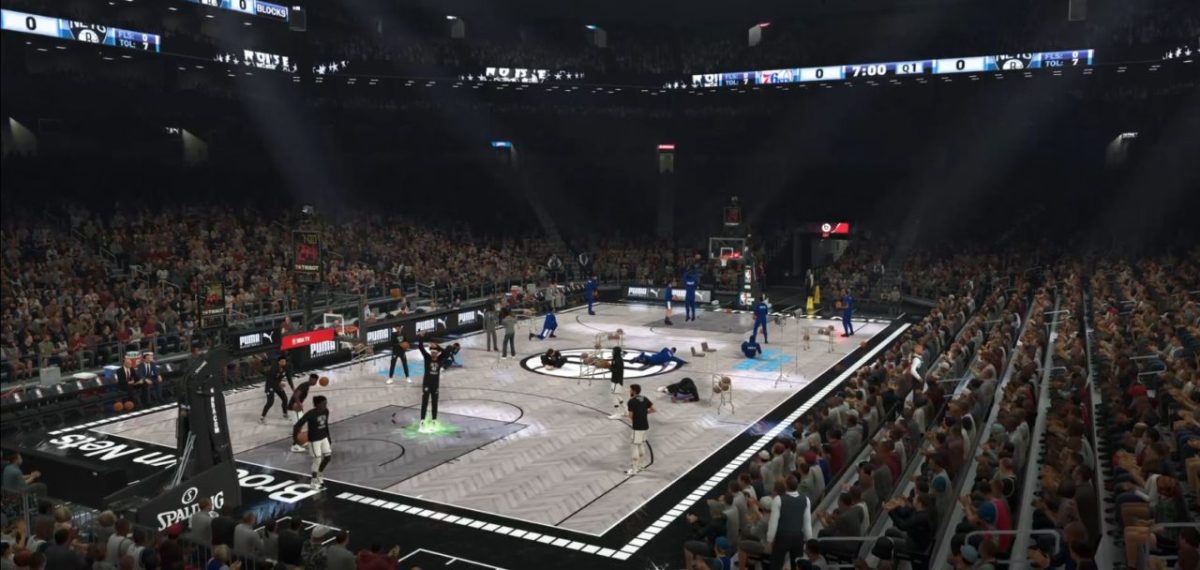
From an NBA 2K20 perspective, the Brooklyn Nets court is of course the one I think of first. I still feel weird playing on it in the game, but am I alone here? It almost feels like a court I would download from 2K Share, or even like the black and white gameplay from NBA 2K12. It does not look as strange on TV, but I’m sure we’ll get some more (hot) takes on the court once the season officially begins.
#RipCity turns 50 pic.twitter.com/1UurHCRZJi
— Portland Trail Blazers (@trailblazers) August 13, 2019
The Blazers are the last team I want to call out here because, man, they just get it right most of the time with this stuff. It’s the 50th anniversary for the Trail Blazers, and they’ve gone back to their retro color scheme to celebrate the occasion. The colors are perfect, and it’s a reminder to teams that you should not change what works. I’m sure it hurts jersey sales at some point to not change things, but it’s like the Celtics adding a black uniform. Don’t do that. There’s no need.
Anyway, what changes do you think are the best? The worst?
Also, a reminder that when the alternate courts and jerseys get added, how they worked in NBA 2K19 is if you selected the “City” uniforms, you got the alternate court if your team had one. I assume the same will be the case this season when they come out.


Published: Oct 21, 2019 3:00 PM UTC